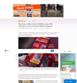
Does MSN.com purposely design their content to display poorly on Firefox, thus urging users to use Edge?
Among other things, in Firefox, the written content is in a panel in the middle of the page. At 100% zoom, the text on the right is partially hidden. In some cases, You must zoom out to 80% to see all the content, rendering the font, in my personal view, uncomfortably small.
Edge does not suffer from this.
Or perhaps there is a way to remedy this?
การตอบกลับทั้งหมด (4)
Have a look at this thread.
Can you attach a screenshot?
- https://support.mozilla.org/en-US/kb/how-do-i-create-screenshot-my-problem
- use a compressed image type like PNG or JPG to save the screenshot
Terry said
Have a look at this thread. https://support.mozilla.org/en-US/questions/1397316MIne doesn't look like that, but the the issues must be related.
I thought that my Ublock Origin was perhaps involved. I disabled it on the page you posted, but it looked the same.
Here is that page at 80% and 100% another, another that represents what I originally reported, and the last one from Edge at 100%.
เปลี่ยนแปลงโดย noel_envode เมื่อ
The MSN pages seem to use some dynamic page layout. You can see this in action by making the page wider and smaller. With some width the page fits for me, if it doesn't fit then I can make it fit by zooming out (between 95% and 70% works).
Being on Linux I'm curious how this works with Edge when you change the screen width as you might have been lucky ?


