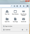
I really, really, really need the orange firefox button back.
I cannot use Firefox anymore if the orange Firefox button is not brought back. The annoyance and anger caused from this is seriously at the point that it causes me physical pain. I would like to make some observations regarding this change.
1. Only you (Firefox, employees and owners) care about the amount of work put into this update. Work means nothing if the result isn't quality. 2. You claim to make Firefox more customizable with this update, but you don't allow users on of Firefox's most useful and classy features after this update. 3. The new menu button does not contain the functionality of the old menu button as the old menu button gave users the functionality of the full menu bar and the new menu button doesn't. Functionality used to be more important to Firefox than design. 4. I get it that you just want to remove the options that people don't use much, but that is what tool bars and icons are for. When someone clicks on a menu, that needs to be the "end all" when it comes to the functionality for a program. When a user has to click around multiple places for more functionality, there is a poor navigation system. Steve Krug wrote this nice book called "Don't Make Me Think" that does a good job explaining how websites should set up their navigation system so that it aids user functionality. 4. You (the admin/tech reading answering this question) are probably starting to role your eyes and think of how I'm just another annoying user who can't handle change and needs stop complaining and just accept that Firefox is doing something good for me. 5. There is a 99.9% chance that my complaint will get a "I'm sorry you feel this way," response and nothing will get done about it. 6. I didn't think Mozilla was the type of company that worked that way.
Please prove me wrong and help fix this problem. If I want a browser with rounded tabs at the top and a mobile phone styled menu button in the top right I can use Chrome. At least their right side menu button is functional. Also, I don't know where you guys get that heat map stuff, but throughout the history of computers, everyone learns from day one that the top right is where you look to close things, the top left is where you go to find your menu.
P.S. I would hope that anyone reading this complaint would know better than to ask what I mean by less functional, but just in case, I will explain. When I click file on the old school menu system that is still permitted, I can choose New Tab, New Window, and New Private Window. In the three line mobile style menu, I cannot choose new tab. Under the File menu, I can choose Open File, Save Page, or Email Link. Under the new menu, I can only choose Save Page. This is the definition of removing the functionality of a menu button.
Izabrano rješenje
in order to get the old menu back, you could use https://addons.mozilla.org/firefox/addon/classicthemerestorer/
Pročitaj ovaj odgovor u kontekstu 👍 1Svi odgovori (4)
hello, though your question is rather lengthy i'm not sure what functionality you're actually missing in the new menu that should be fixed. the samples you have mentioned at the end can all be put into the menu through the customize option: Customize Firefox controls, buttons and toolbars
I'm sorry for causing confusion by errantly including options that can be added to the new menu in my sample. An example of a few options that I cannot add to the new menu are Page Setup, Print Preview, and Work Offline. The video you linked doesn't explain how those options can be added.
Also, I would like to move the menu button to the top left, and also would like to have the option to make it orange and say "Firefox" on it.
Odabrano rješenje
in order to get the old menu back, you could use https://addons.mozilla.org/firefox/addon/classicthemerestorer/
"An example of a few options that I cannot add to the new menu are Page Setup, Print Preview, and Work Offline."
Are you aware that the original (pre-Firefox 4.0 version) Menu Bar still is just one click away? Simply hit the Alt key or the F10 key to temporarily show the real old Menu Bar, which has all the menu items available, including many that weren't in the orange Firefox button - which IMO was a piece of garbage, with the limited number of menu items that it contained, and served to confuse users who were used to older versions of Firefox when they wanted a menu item that wasn't there.
IMO, that 3-bar menu button and panel wasn't made as direct replacement for the former orange Firefox button menu - its' value is to replace the now missing Add-on bar, otherwise IMO Mozilla wouldn't have made those buttons so large, and taking up so much space.
Then again, this new UI isn't made for desktop PC's, it was made for Mobile devices and then adapted to function in the desktop environment. Desktop users "got the short end of the stick".

