Folder view, menu bar, and calendar time issues
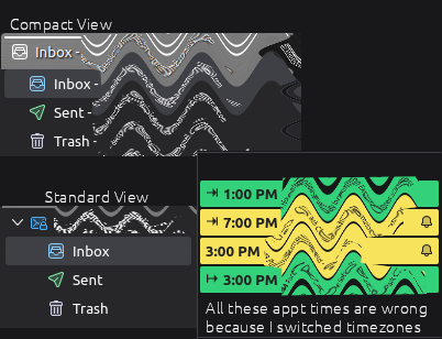
Since version 115.3.1 (64-bit) to present version 115.5.0 for Linux Mint (using Vertical View and Favorite Folders' 'only), the Compact Folder View is no longer compact at all. Each folder also includes my email address on each line making it take up 3x the space now. I can turn off the Compact View to actually get a more compact view, but this standard view shows a box with my email address above the folders, plus the folder tree. It was so clean looking before.
Is there no way to put the Menu Bar up top anymore? The very top bar is the customizable bar instead. It should be the other way around.
Most annoying is with the calendar when I put in an appointment or reservation for a future date, if I move timezones (I travel a lot), it changes the time with each timezone I pass through. For instance, if I make an appt for 11 am, it should be local time regardless of location. When I change timezones as I get closer to my appt location, it changes my appt to 12 noon, etc., potentially causing me to be late.
Alle svar (3)
Lets start at the beginning. The standard for calendars is to use UTC time. That way they can be timezone aware. So I guess you need to start putting your calendar events in in UTC as well so they don't change as the time zone changes.
Menu bar is as simple as some CSS. https://support.mozilla.org/en-US/questions/1422908#answer-1601470
I am not competent to talk about the compact view... all I can make it do is list one folder in one account and make the account name appear and disappear as the parent folder when I switch to compact. Nothing useful that can comprehend.
The menu bar answer worked perfectly. Thanks! Wish there was a fix for the calendar time though. I know I can put down the time for the current timezone so when I'm in the appt timezone, it'll correct itself, but the default should just be to keep the time you set on the event. It makes zero sense to change with timezone.
re : the Compact Folder View is no longer compact at all. Each folder also includes my email address on each line
I've just tested this and I now understand what you are saying. If I have 3 mail accounts and I have selected each 'Inbox' as a 'Favourite' folder. Normal view shows account name with 'Inbox' as sub to it. Compact view moves everything to a one liner, so I now see 'Inbox - mail accountname' on one line. It's really useful because how would I know which Inbox was which account because the folder names are the same. But at least I see your point.

