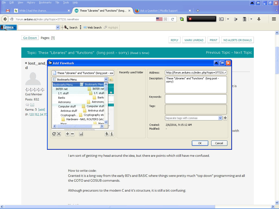
What has heppened to the bookmark menu?
Folks, I don't like to complain for no reason, but I think this is a real "problem".
I am sure I am not the only one who has SQUILLIONS of bookmarks.
Something dramatic has happened recently and when I say "bookmark" the window which opens is confusing and nothing like the old one. The help page reflects the old version and doesn't explain the new layout.
Attached is what I get and when I open the dropdown from the "bookmarks menu" I get ........ well, you tell me.
On that, the OLDER version - which I don't have a picture of - was problematic because although it offered a little list of "recent folders used" in the bookmark list, it was a SHORT list and didn't show the full path.
Say I have a REFERENCE BOOK group in my bookmarks. In that, I have a group for ...... Chemistry, Physics, Mozilla
Then I have an ADDON group. And in there are a few folders and included in that is one called Mozilla.
One day I am at a site and find a good article on Mozilla. I book mark it and put it in the REFERENCE BOOK / Mozilla part. That then becomes one of the options in the "quick list" for next time.
Another day I find a great add on and book mark it. So it goes in the ADDON / Mozilla part.
Now, when I open the quick link, I see: Mozilla and Mozilla.
Not really helpful.
Anyway, what is going on with the picture and why is it corrupt?
It makes bookmarking twice as painful as before.
All Replies (7)
Well, that is the ViewMarks extension Add ViewMark dialog, not the built-in Edit Bookmark dialog you saw in the support article. Perhaps it has a compatibility issue with Firefox 43?? You could try contacting the author at [email protected] to see whether it is a known issue and whether it has a workaround.
Regarding the built-in dialog, you're right that the "recently used" folder drop-down doesn't have the full path, so you would need to open the full list control and select the folder from there. I don't know whether anyone has created an add-on to fix that.
BIG BLUSH!
Thanks very much.
That is strange though.
As, until only recently I have not seen that layout for bookmarks.
I have seen what I believe to be the default FF bookmark page.
It was only when I did an upgrade did it START to show like that. Therefore I thought (yeah, I know.......) it was a FF problem.
Ok, I'll have to cop that one.
But on the built in one: Can the length/size of the drop downs be increased? The size and "length" (of 4) is somewhat lacking. And of course a slightly better path list too.
Sorry, I shall have to try disabling the addon and see what happens, but I shall say it is the problem.
So please don't be upset if I haven't marked it as SOLVED just yet. I would prefer to make 100% sure first and just now I am chin deep with other problems too.
Modified
Hmm, unfortunately I don't see any way to alter the built-in dialog:
- the limit of 5 most recently used folders seems to be hardcoded, and I don't see any "about:config" preference to override it
- the folder path isn't stored in the menu, just the folder name, so there isn't a way to easily modify the appearance with a style rule
Thanks again. (As I get the reply, I feel obliged to respond as best I can.)
Yes, I know the limit is "hard coded" I am mentioning this "problem" so the powers that be may allow this to be enlarged and the path name to be also shown.
It isn't something we (at this level) can do.
I only mentioned that because I thought all these were related and hadn't realised that part of the problem was an add-on.
So if there was a "problem" then I may as well mention the THREE problems rather than just the one and then the other and the other....
"Fix" (address?) all three at once sort of thing.
You can also submit suggestions on the following site. Ideas tend to get lost here in the blizzard of support requests.
Thanks.
See also:
- Add Bookmark Here 2: https://addons.mozilla.org/firefox/addon/add-bookmark-here-2/

