Customising tab position in FF57 on Mac not perfect
Hi,
I use the following css to get the tabs down below the line of bookmarks (which should be the logical position anyway from a ui perspective):
/* Tab bar below Navigation & Bookmarks Toolbars
For best results, show Title Bar or Menu Bar */
- nav-bar { /* main toolbar */
 -moz-box-ordinal-group: 1 !important;
 border-top-width: 0 !important;
}
- PersonalToolbar { /* bookmarks toolbar */
-moz-box-ordinal-group: 2 !important;
}
- TabsToolbar { /* tab bar */
-moz-box-ordinal-group: 3 !important;
}
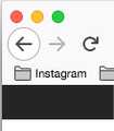
However, the top area (colour buttons) is now overlapping the FF back arrow. Does someone have a suggestion for a css to fix this?
Thanks a lot.
Chosen solution
Ok, solved it. With this css the mac's three bbuttons red, yellow, green appear properly again:
/* Tab bar below Navigation & Bookmarks Toolbars
 For best results, show Title Bar or Menu Bar */
 #nav-bar { /* main toolbar */
 -moz-box-ordinal-group: 1 !important;
     padding-top: 22px !important;
 border-top-width: 0 !important;
  }
   #PersonalToolbar { /* bookmarks toolbar */
  -moz-box-ordinal-group: 2 !important;
  }
  #TabsToolbar { /* tab bar */
-moz-box-ordinal-group: 3 !important;
  }
Read this answer in context
👍 1
All Replies (5)
Try this for the navbar rule:
    #nav-bar { /* main toolbar */
      padding-left: 75px;
     -moz-box-ordinal-group: 1 !important;
     border-top-width: 0 !important;
}
1st screenshot with your suggestion, 2nd one as I had it before.
Cheers
sorry screenshot of your s wasnot detailed enough
Oh, if you have the bookmarks toolbar on top you probably need to apply the padding to that:
    #PersonalToolbar { /* bookmarks toolbar */
    padding-left: 75px !important;
 -moz-box-ordinal-group: 2 !important;
}
Suluhisho teule
Ok, solved it. With this css the mac's three bbuttons red, yellow, green appear properly again:
/* Tab bar below Navigation & Bookmarks Toolbars
 For best results, show Title Bar or Menu Bar */
 #nav-bar { /* main toolbar */
 -moz-box-ordinal-group: 1 !important;
     padding-top: 22px !important;
 border-top-width: 0 !important;
  }
   #PersonalToolbar { /* bookmarks toolbar */
  -moz-box-ordinal-group: 2 !important;
  }
  #TabsToolbar { /* tab bar */
-moz-box-ordinal-group: 3 !important;
  }


